If you’re a regular visitor to Zip’s website you’ll have noticed we recently launched our new look site featuring lots of recent work and our latest Zip logo.
From time to time (a bit like Dr Who…) our logo regenerates with a fresh look and feel. The latest version plays on optical illusions like the classic Penrose triangle made famous by the works of M.C. Escher. The Z, I, P characters are 2 dimensional depictions of 3 dimensional shapes but the direction of each visual extrusion contradict one another making the shape impossible as 3 dimensional object…

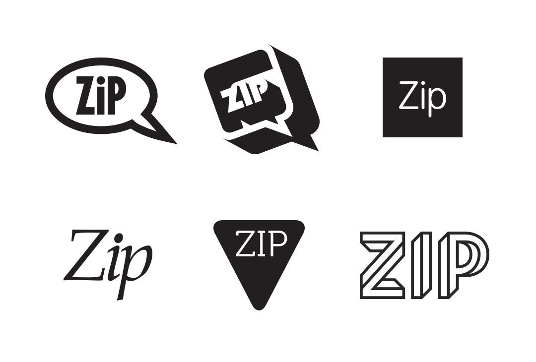
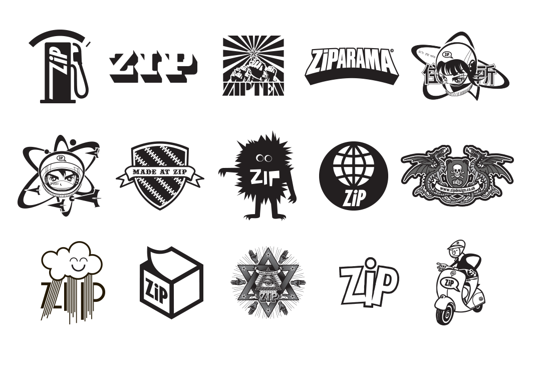
We thought being as it’s #TBT we should also dig out all the old Zip logos (from way back in 1996) to some of the more random Zip icons we’ve designed over the years for our promotional stickers, tumblers, rubber stamps, tattoos, badges etc. Enjoy!


